Hey there! What's up! :)
Today I will try something different. I'm covering a design I did a while back: a poster for a game tournament, Left 4 Dead. My friend, Darren Lee, was the organizer of the event. (He's currently practicing violin and blogging about it daily. Do check it out if you have time.)
This is how the final result looks like.
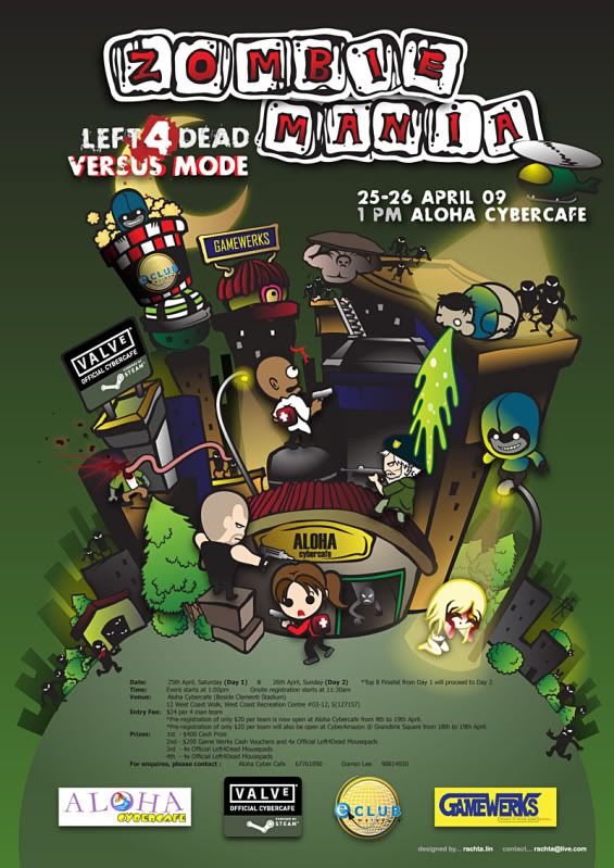
I will be talking about my concept sketch, the process, and design. If you are interested how the work has been thought out from the ground up, do keep on reading. :)
Now let's get started! ^^
A few years back, when the game Left 4 Dead first came out, it had become pretty popular.
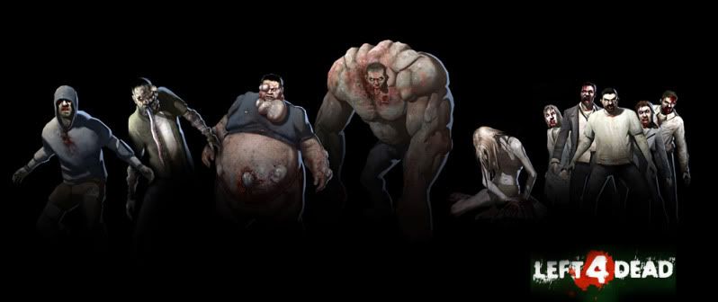
In case you don't know what Left 4 Dead is, it's an online survival horror FPS (First Person Shooter). You and 3 other people are the survivors in a zombie apocalypse, and need to fight your way out to the safe zone. The unique thing about the game is that, you can also choose to play as 'The Infected', a team of mutated zombies with special ability, to prevent the human survivors from reaching the destination alive. It’s a men-VS-zombies kind of game instead of your normal men-shoot-men FPS. The mechanic of the game was quite unique and refreshing in a sense, and even though FPS isn’t really my cup of tea, I found this game to be very fun and addictive.

The survivors team
The Infected team
The concept had been settled in words, and now it’s my turn to come up with the right design. I spent my time sketching, thinking of the art direction and style. I ended up with rough images of a few concepts I had in my head, and then presented to Darren for his opinion.
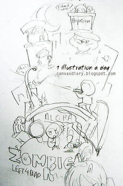
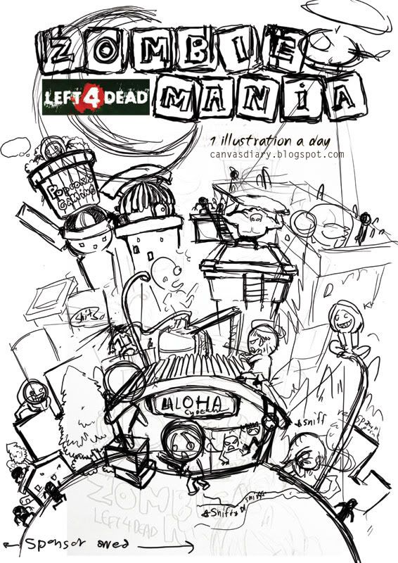
We both agree that this design sketch was our favorite.
Something fun and lively. A fully illustrated poster depicting a fighting scene in the game, survivor team VS zombie team in a building called ‘Aloha’, the name of a LAN gaming center that we will use as the tournament destination.
After we agreed on this design, I further develop the piece into a more detailed sketch.
Before I came up with this sketch, I spent quite a while trying to get accustomed to drawing a ‘chibi’ style (smaller and cuter version) of the characters. Making a serious-looking 3D characters and horrendous monsters into something funny and cute was a bit tricky. Cutting out unnecessary lines and simplifying the details are key. I drew a detail-down, cartoony version of a character, then I cut out a few lines and details, then I redrew it in an even more simplified version. It went on and on until I arrived at the desired result.
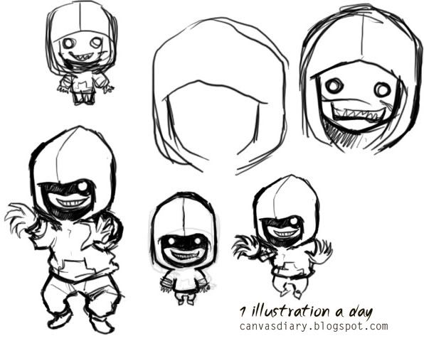
One of my character sketches in initial stage : The Hunter
Darren happily approved of the sketch. When everything was set to go, I started right away on the illustration. After a few days, it was done.
Software : Sketches done in Adobe Photoshop. Vector art done in Adobe Illustrator
The result was more than a satisfactory, and it seemed people in the event loved it a lot. It’s a fun project and I need to thank Darren for giving me this opportunity. It’s by far one of my best vector illustrations.
Hope you enjoy my post for today. :) The journey will begin again real soon.




0 comments:
Post a Comment